Creating a peaceful and relaxing home environment often starts with the colors you choose for your walls, furniture, and accessories. Calm colors can help reduce stress, improve mood, and create a welcoming atmosphere for family and guests alike. If you’re looking to refresh your space with soothing tones but aren’t sure where to start, this guide will walk you through practical tips for choosing calm colors that suit your home.
Why Choose Calm Colors?
Before diving into specific hues, it’s important to understand the benefits of calm colors:
– Reduce Stress: Soft and gentle colors can help your mind unwind after a busy day.
– Promote Better Sleep: Bedrooms painted in calming shades encourage restfulness.
– Create Harmony: Coordinated calm tones allow different rooms to flow together smoothly.
– Make Spaces Feel Larger: Light, muted colors reflect more light, enhancing openness.
Popular Calm Colors and Their Effects
Different colors evoke different feelings. Here are some popular calm tones and how they typically affect a space:
Blues
Blue is often associated with tranquility and stability. Light blues resemble the sky or water, creating a serene vibe perfect for bedrooms or living rooms.
Greens
Green signifies nature and renewal. Soft greens can be refreshing and restful, helping to balance energy in any room.
Neutrals
Colors like beige, taupe, soft gray, and off-white offer a neutral backdrop that feels warm and inviting without overwhelming the senses.
Lavenders and Soft Purples
These shades give a gentle touch of color while still maintaining a quiet, restful atmosphere.
Tips for Choosing Calm Colors
1. Consider the Room’s Purpose
Think about how you will use the room. Bedrooms benefit from cooler, muted blues and greens to support rest. Living rooms can handle soft neutrals or subtle greens for social relaxation. Bathrooms often feel spa-like with pale blues or lavender.
2. Test Colors in Different Lights
Natural and artificial light affects how colors look. Paint samples on your walls and observe them throughout the day—morning, afternoon, and evening—to ensure the color remains calm and appealing.
3. Use Color Palettes for Balance
Avoid walls, furniture, and decor all in the same calm shade. Instead, layer colors using palettes. For example, pair a light green wall with cream-colored furniture and soft brown accents for warmth.
4. Choose Matte or Satin Finishes
Glossy finishes can be distracting and reflect light harshly. Matte or satin paints tend to have a softer, more calming visual effect.
5. Incorporate Natural Elements
Colors inspired by nature—such as earthy greens, sky blues, or sandy beiges—feel inherently calming. Bring natural textures like wood and stone into your decor alongside these colors.
6. Avoid Overly Bright or Saturated Colors
Bright reds, yellows, or intense purples can create energy and excitement but are less relaxing. If you love bright colors, incorporate them sparingly as accents rather than the main wall color.
7. Use White Wisely
White can be calming when bright and clean, but too much stark white might feel cold or clinical. Soften white walls by adding warm-toned accessories or trim.
How to Combine Calm Colors in Your Home
Combining calm colors effectively requires attention to flow and contrast.
– Monochromatic Scheme: Use different shades and tints of one color for a cohesive, tranquil look. For example, several shades of soft blue throughout a family room.
– Complementary Colors: Choose colors opposite each other on the color wheel but softened, such as muted green paired with a dusty pink.
– Analogous Colors: Select colors next to each other, like soft green, pale teal, and light blue, to naturally blend and promote calmness.
Final Decorating Tips
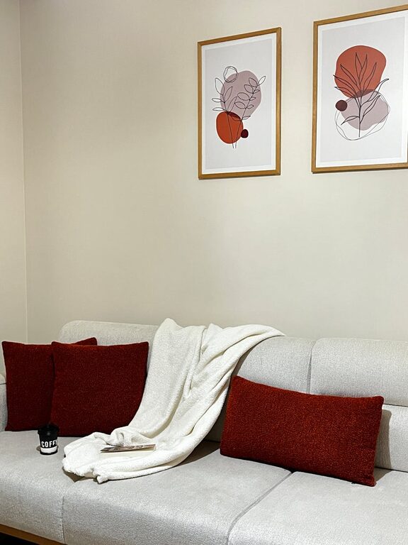
– Add Texture: Even with calm colors, varied textures prevent your space from feeling flat. Think woven rugs, linen cushions, and soft throws.
– Mind the Accent Pieces: Incorporate calm colors in lampshades, wall art, and curtains to unify your decor.
– Declutter: A calm color palette works best in an uncluttered environment—keep your home tidy to maximize the feeling of peace.
Conclusion
Choosing calm colors for your home is a wonderful step toward creating a sanctuary that nurtures both relaxation and style. By understanding which hues promote tranquility, testing colors in the right light, and combining tones thoughtfully, you can transform your home into a peaceful retreat. Remember, the best calm color is one that makes you feel comfortable and happy every time you enter the room.
Take your time exploring colors, and don’t hesitate to consult color swatches or paint samples before committing. With these tips, your home will soon become a calm oasis you love spending time in.